Introdution: A Delicate Handwritten Font for Digital Charm
It started with a hero section. I was redesigning a boutique coaching website—soft tones, intentional whitespace, and a warm, human voice. The client wanted to feel “inviting but elevated,” not cold or corporate. So I dropped Introdution into the headline: “Your First Step Forward”. Instantly, the layout softened. Not in a weak way—but like light catching dust motes in a sunlit room: gentle, intentional, quietly confident. That’s when I knew this wasn’t just another script font—it’s a digital tone-setter.
What Introdution Brings to the Screen
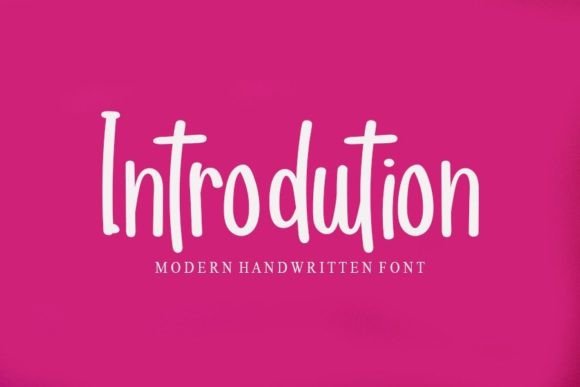
Introdution is a sweet, delicate handwritten font from Script Amp—a premium font designed for moments that need warmth and personality. Visually, it’s dainty without being fragile: fine hairlines, subtle bounce in the baseline, and graceful entry/exit strokes that suggest movement—not speed, but ease. It reads as joyful, romantic, and deeply personal—like handwriting you’d find on a thank-you note tucked inside a gift box. As a display font, it doesn’t shout. It leans in.
In web design, that quiet presence is gold. On landing pages, it lifts headlines above generic sans-serif fatigue. In portfolio headers, it signals creativity without sacrificing clarity. And because it’s a true handwritten typeface—not an over-embellished calligraphic script—it avoids visual clutter, even at smaller sizes (more on that soon).
Real Layout Testing: Where It Shines (and Where It Doesn’t)
I tested Introdution across three real contexts: a product landing page for a mindful journal subscription, a blog header redesign, and a campaign banner for a seasonal digital brand kit. Here’s what held up:
- Hero headlines (36–60px): Crisp, legible, emotionally resonant—especially over soft image overlays or muted gradients.
- Section headings (24–32px): Adds rhythm and warmth without disrupting vertical flow. Paired beautifully with Inter and Montserrat for body copy.
- Call-to-action buttons (18–22px): Works well on light backgrounds with sufficient contrast (I used #333 on #F9F7F5). Avoid dark-on-dark combos unless you boost letter spacing slightly.
- Digital brand kits & social banners: Its light weight and organic flow translate elegantly to SVG exports and Figma auto-layouts.
Where it stepped back: small navigation labels (<14px), form field placeholders, and dense dashboard UI elements. That’s not a flaw—it’s alignment with its purpose. Introdution is a display font, not a utility font. It’s meant for moments of emphasis, not endurance.
Responsive Behavior & Mobile Readability
On mobile, Introdution holds up surprisingly well—thanks to generous x-height and open counters. At 28px on iOS Safari and Chrome Android, it remained legible even without bold weight support. I did add font-weight: 400 and increased letter-spacing by 0.5px in CSS for tighter lines—just enough to prevent visual crowding on smaller screens.
One note: avoid stacking multiple Introdution lines tightly on mobile. Let it breathe. I used it for single-line headlines only on mobile views, then expanded to two-line subheads on tablet and desktop. This preserved scannability while honoring its delicate nature.
Smart Pairing for Digital Branding
Script fonts live or die by their pairings—and Introdution thrives alongside clean, humanist sans serifs. I paired it with Inter (for its neutral warmth and excellent screen rendering) and IBM Plex Sans (for editorial balance). Both provided strong contrast without competing: Introdution brought personality; the sans serif brought trust and function.
For more editorial sites—like a creative writing blog—I tested it with Charter, a thoughtful serif. The result felt grounded yet expressive: Introdution for pull quotes and section dividers, Charter for long-form reading. No pairing felt forced. Each combination supported hierarchy—not fought it.
Licensing, Formats & Practical Integration
Before dropping Introdution into a live site, I checked the included assets: WOFF2 (optimized), OTF, and TTF files—plus full commercial licensing for client work and SaaS platforms. No hidden restrictions. No surprise fees for e-commerce use or newsletter graphics. That matters—especially when building reusable design systems or white-labeled templates.
I also confirmed multilingual support covered basic Latin-1 (accents, umlauts, ñ), which covers most English, Spanish, French, and German use cases. For deeper language needs—like extended Cyrillic or Vietnamese—I’d verify with the foundry, but for 90% of small business and creator sites, it’s ready.
Pro tip: Load Introdution as a display font only using @font-face with font-display: swap. It’s lightweight (<25KB WOFF2), so it doesn’t drag down LCP—but letting fallback text appear first keeps perceived performance high.
When to Reach for Introdution—And When to Pause
Reach for Introdution when you want to:
- Add warmth to a minimalist portfolio or creative agency homepage
- Humanize a wellness, coaching, or lifestyle brand’s voice
- Create emotional contrast in a data-heavy SaaS landing page
- Design elegant email headers or digital course module titles
- Build cohesive, on-brand social media graphics (especially Instagram carousels and Pinterest pins)
Pause before using it for:
- Body copy longer than one sentence
- Accessibility-critical interfaces (e.g., medical or financial tools where legibility is non-negotiable)
- High-contrast dark mode defaults without testing glyph clarity
- Logos requiring extreme scalability (it’s lovely at 40px—but test at 12px for favicons)
In the end, Introdution isn’t about decoration. It’s about intentionality. It reminds us that digital spaces don’t have to feel transactional—and that the right handwritten font, used thoughtfully, can make users feel seen before they’ve even scrolled past the fold.